Showing posts with label Wplus9. Show all posts

Wednesday, 30 December 2015

My best nine in 2015!

Hello!

Today I'm here to share my best nine projects for the year of 2015 and I explain a bit why on each one. These come in the published order. So here we go:

1) A window Thank You


This card was made inspired by the CTS sketch. This is special to me because this was first  card that I coloured combined watercolours and Inktense pencils. I'm very pleased how the colouring turned out and that time I was very into window cards. 

2) Pink Flower Thank You


This card was made to the DT introduction post for Altenew. This card is very special to me since I used Kuretake Gansai Tambi watercolours that I had just received to colour the flowers and I just love how softly they look. And the window theme continued also.

3) African Sunset


I included this card into the best nine because I love to colour and I usually make cards that have coloured focal point. This card I made without colouring and I really really like the intensity and dimension it has.

4) A beautiful Day 


This fall I found my favourite colouring medium (at least at the moment) and it is copic markers combined to coloured pencils. The flower in this card is one of the best flowers that I personally think I've coloured so far.

5) Modern Congratulations


This card is pretty simple in design and lay-out but for me it is special because I'm very proud of how I was able to colour the leaf at the bottom to look like a real leaf - and I've had issues in colouring leaves.

6) You are made of awesome 


If I have to choose only one card from my 2015 cards, it would be this one. This is absolutely my favourite from this year. I am very pleased with the colouring and the shading and I am very happy that I was able to gain such a clean design to this. The font of the sentiment fits also perfectly to the flower. I wouldn't change a thing in this card.

7) Merry and Bright


I made this card a special crafting friend in mind who usually watches my videos over her morning coffee so I thought this POD owl would be perfect for her. I am really happy how the colouring turned out to be, I think he is the best coloured critter from this year. I'm also very pleased with the sky colour that I recently found and love the effect of white gel pen in the sky.

8) Beauty of the Season


Usually, in the cards that I make there are some parts that I'm very happy with and some parts I would change if I made that card again. In this card I wouldn't change anything and that is very a lot to say after how many days I actually tried to put this card together. I had coloured the image and I played around so many leaves, diets and sentiments. But the end result is what matters and I'm happy with it.

9) Frozen


This card is one of the latest cards that I made for this year and this got its ticket to my best nine because of the sky. I really tried to gain a feeling of a bright and cold winter night with a full moon. I'm very happy with how it turned out. I also practiced back-lit shading for the image and although I have to practise more I like how it turned out.

Well, this was the best nine of the 2015! Hopefully some of your favourites also found its way to this group. If your favourite is missing, let me know! :)

Thank you for stopping by and see you soon!


Tuesday, 29 September 2015

Polychromos on vellum

Hello,


Today I'm here just for fun.. It's been so long that I've crafted just for fun and not any kind of purpose in mind. I've been longing to participate on challenges but I've hadn't had time to do so today I visited a couple of my favourite card challenges and played around with some crafty goodness and my polychromos. Here's what I came up with.. and just a note... I had so much fun today!! YAY!


This is my entry to the Throwback Thursday #7
Less is More #243 and Inkspirational Challenge #92.


Here's another one that I made with the same technique on the butterfly. I tried to CASE Tracey's card.. This card was supposed to be very simple having just one butterfly on a inked background.. While listening my favourite music on the back I kinda got carried a way... sorry Tracey. Hopefully you don't mind.

This is my entry to the Time Out Challenge #40.


Otherwise these cards are pretty straight forward but I did experimented a new-to-me colouring technique in these cards - I used my polychromos to colour on vellum and it worked perfectly. I might a shoot a video on this if you're interested. I coloured the flowers first with copies and then added details with pencils. 

I will enter these cards for following challenges:

Throwback Thursdays #7 at Wplus9 - I used Flora and Fauna 2 by Wplus9

Less is More #243- Something Shiny - I found that White Pearl embossing powder and sequins very very shiny in real life. Quite hard to capture in photo though.

Inkspirational #92- photo inspiration - I used their fall colour theme

Time Out Challnge #40 - CASE Tracey - I was inspired by the vellum and inked background.


Supplies:
Stamps: Flora and Fauna 2 and A new day by Wplus9, Baby Zoo by Altenew
Inks: Versamark, Versafine Onyx Black, Appeltini Pure Color Die ink by Wplus9, Shabby Shutters and Scattered Straw Distress Inks, Frosty Pink and Coral Berry Crisp Inks by Altenew
Dies: Pierced Squares Die-namics by MFT
Paper: Canson Bristol 250gms, Neenah Solar White 80lb, Linen Effect paper by WHSmith, a stripe of textured light green cars stock
Vellum: Pink and light green vellum by Inspire Me
White Pearl Embossing Powder by WOW!
Sequens: Lime Sorbet and Lemon Merigue by Pretty Pink Posh, Assorted Moonshine by SSS

Polychromo Pencils: Earth Yellowish Green (168), Green Opaque (174), Black (199), Pink Madder Lake (129), Madder (142), Magenta (133), Walnut Brown (177)

Derwent Coloursoft Pencils: Orange (C070)

Copic Markers: Y15 - YR23

Thanks for stopping by today and have a wonderful day!

Marika

Thursday, 10 September 2015

Miss You Lots with Inktense Pencils

Hello crafters,

I was kindly ask to Guest Design at the Time Out Challenges #39 where the theme is Make your Mark. The challenge is still going on for about a week and I did another card for your inspiration. 

I've purchased this adorable little girl called Miss you Lots by Wplus9. I just haven't had time to colour it until now. While I bought these I thought that they would make a perfect gift for my Goddaughters and this is my first one (of quite a many) and it'll be for my niece. Hopefully she likes it when she receives it. It would be super neat if Dawn would use her magical drawing skills and make a set of stamps like this but little boys in them... What would you think? 


I took a close up since those frames were the only ones that I could find while taking a photo... AND they are HUGE!!. I used no-line colouring technique with Inktense Pencils. For the trees on the background I used a stamp from Coming up Roses and did a bit of watercolour stamping. I very much like how this turned out, in particular I like how the dress turned out. (Many many MANY layers of Inktense pencils...) Lol! And I had a blast colouring! 

Supplies:
Stamps: Miss You Lots and Coming up Roses by Wplus9
Inks: Memento Desert Sand. Peeled Paint, Shabby Shutters and Gathered Twigs Distress Inks.
Paper: Daler & Rowney Simply... Watercolour paper 190mgs/90lb, medium grain textured surface

Derwent Inktense Pencils: 
Dress: Sicilian Yellow (0220), Cadmiun Orange (0250), Baked Earth (1800) 
Boots: Sicilian Yellow (0220), Spring Green (1550), Light Olive (1540), Sepia Ink (2010) Hair: Tan (1720), Amber (1710), Saddle Brown (1740), Willow (1900) 
Skin: Willow (1900) 
Petticoat: Sepia Ink (2010)
Kitty and stones: Chinese Ink (2030)
Sky: Iris Blue (0900)
Lake: Iron Blue (0840)
Lakeshore: Tan (1720), Saddle Brown (1740), Willow (1900)
Grass: Spring Green (1550), Light Olive (1540)

Thank you so much for stopping by today! Enjoy your day!

Marika


Sunday, 26 April 2015

Freshly Made Sketches #183 and ColourQ Challenge #288

Hello my friends,


This is my entry to the Freshly Made Sketches #183
and to the ColourQ Challenge #288.

This card was Princess of Clean in FMS and
was chosen as ColourQ at the ColourQ.


The inspiration to this card comes from a few challenges. I started to make this card to The Paper Players watercolour challenge but when I started to submit it I noticed that I had missed the deadline. I took the sketch from Freshly Made Sketches and the colours from ColourQ. I have to admit that there is a bit of grey in the background because while making this I remembered the colours wrong. I thought the grey was in the colours, I am entering this anyway since grey is one of the neutrals and I could have achieved the same look with second generation stamping with black ink. But if the ladies at ColourQ interpret my colours differently, please remove my card from the gallery. I just love the look of these butterfliers - the embossed white veins are think are so beautiful. This stamp is so detailed that it was a pleasure to colour these.

I will enter this into the challenges:
Freshly Made Sketches #183 - the sketch
ColourQ Challenge #288 - the colours


Supplies:
Stamps: Flora and Fauna 2 and Borders and Backgrounds 3 by Wplus9
Dies: Hand Lettered Thanks Die by Wplus9
Inks: Versamark, Pure Color Fairy Dust by Wplus9
Papers: Canson 180gms Watercolour Paper, Neenah Solar White 80lb, Neenah Desert Storm 80lb, Papermani Textured Card Stock 180gms
Embellishments: Neat and Tangled Spring Mix Sequins

Thanks for visiting! Have a wonderful day!

Marika


CAS(E) this Sketch #120, Throwback Thursday #3 and Simon Says Wednesday Challenge

 Hi Everyone!


This is my entry to the CAS(E) this Sketch #120, Throwback Thursday #3
Inkspirational #81.


I've been anxiously waiting for my parcel from Wplus9 to arrive and it finally arrived this Monday. I was so amazed how fast it was shipped (within 2 hours after I placed my order). Delivery to Helsinki was quite fast (about a week) BUT then the parcel was held at the customs and it took almost two weeks to get here... You might be able to believe that every afternoon I was waiting the post to come like a little kid at  Christmas and every time I was disappointed. Just knowing that the parcel is just sitting at the customs to be declared kind of made me crazy... Well, it arrived and my girls and I were as happy to go through all the stuff that we had ordered. My girl wanted to colour the Miss you lots -girl and I went for this gorgeous image of a this little Chickadee. Before we started on Thursday, I went and looked up the newest challenge at the CAS(E) this Sketch. I was so amazed to see how perfectly this stamp was made for their challenge. Thanks for my friend Michele who pointed out for me who this bird really was since I think we only have his relatives living here in Europe.  I googled him and tried to stay true to his real colours, I believe he got more yellow under his chest as he might have but I doesn't really bother me - at all. 

I had a tons of fun watercolouring this image. I stamped the image with light brown ink and I used Kuretake Gansai Tambi watercolours and as I usually go for one colour and use the shades of that to colour and to add dimension and shading to my watercolours, I wanted to challenge myself to actually colour as it is meant with watercolours. While I was adding another washes of different colours and shades of those colours on top of each other, the bird started to look like a REAL bird. I was so amazed that I had just painted this, so amazed. I've never done anything like this before and I will certainly keep this card to myself. I would like to thank Dawn and Wplus9 for making this stamp since the design is all theirs - I just added the colour.

I will enter this into these challenges:
Inkspirational  #81 - Space - I have lots of white space in my card


Supplies:
Stamps: A new day by Wplus9
Paper: Canson 180gms watercolour paper, Colour Me 180gms card stock (grey)
Kuretake Gansai Tambi watercolours: no. 61, 67, 32, 53, 54, 47, 44, 40, 20, 46
Derwent Inktense Pencils: Iron Blue (0840), Iris Blue (0900) (Background)

Thank you for stopping by today! See you soon! 

Saturday, 4 April 2015

CAS(E) this Sketch #117, CASology #140 and ColourQ #285

Good Afternoon!


This is my entry to the CAS(E) this Sketch #117, CASology #140
and ColourQ #285

This card was CTS Winner, ColourQ at the ColourQ 
and the Winner at CASology.


I made this card a few challenges and more importantly one crafting friend in mind. The sketch is from the CAS(E) this sketch and the theme is from CASology. What can be more spring than butterflies and bright, rainbow colours - at least that was what came to my mind when I thought of the word spring. And so conveniently the ColourQ almost had the colours that I would had gone anyway so I used their colour combo. Then I stopped and one particular person came into my mind who might like this card and she is my dear crafting buddy Kelly! If you haven't visit her before, I encourage you to do so. She is fabulous in her designs and colouring but the talent that I admire the most is the fabulous way how she uses bold and rich colours and she still is able to maintain CAS and very stylish look! This is for you Kelly! Thank you for your endless inspiration! 

I was kind of horrified to start to colour this since I don't think I am good at using this much different colours - I usually stick with neutrals plus one to two colours the most. I stamped the butterflies with light yellowish ink onto a watercolour paper and then watercolored the butterflies. I die cut the sentiment and out of white cardstock (yes! I finally got the courage to do this!!) and adhered four layers on top of each other to get the sentiment to pop up. The little butterflies are hand cut with scissors and then adhered with either foam tape or liquid glue. The watercolour panel is then adhered to the card base. 

I will enter this into these challenges:
CASology #140 - spring - butterflies and rainbow colours reminds me of spring
ColourQ #285 - Melon Mambo, Daffodil Delight, Kiwi Kiss, Cool Caribbean


Supplies:
Stamps: Flora and Fauna 2 by Wplus9
Dies: Hand lettered Thanks by Wplus9
Inks: Antique Linen Distress Ink
Watercolour: Kuretake Gansai Tambi No. 34, 43, 33, 5, 63 and 20.
Cardstock: Daler Rowney Aquafine Watercolour paper 300g/m2, Canson Watercolour paper 180g/m2, WHSmith Linen Effect paper 150g/m2

Thank you for stopping by today! Have a wonderful Easter holidays!

Marika

Sunday, 22 March 2015

The Card Concept #31, CASology - Blossom and Wplus9 Throwback Thursday Challenge #2

Good Afternoon!


I had the whole day yesterday time to do what ever I wanted. My husband spend the day with the kids and gave me time to myself. So, I am back today with a card that I made with a few challenges in mind and mainly inspired my Michelle from Amusing Michelle. If you haven't admired her work already, please go and visit her - she is truly amazing!


This is my entry to the Card Concept #31,
CASology - Blossom and Wplus9 Throwback Thursday Challenge #2.

This card was one of the winners at the Card Concept.
I've had this stamp set called Pretty Peonies by Wplus9 since last November. I've admired and adored Dawn's beautifully watercoloured peonies and watched her tutorial many times. Also Michelle is very very talented in whatever she does and she had made so many beautiful cards with this stamp set. Every time when I've seen her cards, I've tried to stamp, colour with Distress Inks, traditional watercolours, copics... But I was only able to make a huge mudy mess with it and even though I've heard that you should just make something that reminds you of a flower so that your brain can see it as a flower. Not even my husband couldn't see the flowers in those previous attempts of mine so it wasn't just me.. Michelle did this card for the CAS(E) this Sketch this week and gave me enthuasism to try again and this time I was determined to make this into a flower. And this time I am able to see the flowers and I am very very happy with the outcome - finally!

I used Dawn method but I changed it a little. After so many attempts I realized that I couldn't see the shape of the flower just stamping the middle layer. So, I stamped the base layer with Spun Sugar and then added the second layer with Worn Lipstick on top. And then added the water and the details. 

I will enter this into these challenges:
The Card Concept #31 - The theme there is Cupcakes but I used the colours of their inspiration picture. I will enter this into Clean and Layered category
CASology - Blossom - Hopefully this is still CAS
Wplus9 Throwback Thursday Challenge #2 - Vintage Flowers

Here are the graphics:


Supplies:
Stamps: Pretty Peonies by Wplus9, Birthday Greetings by Altenew
Inks: Spun Sugar and Spiced Marmelade DIs, Milled Lavenler and Worn Lipstick Distress Markers, Versafine Onyx Black
Cardstock: Langton Watercolour Paper 300g/m2, Neenah Solar White 80b, Exotic Paper White Silk


Tools:
Hanart Watercolour Brush no.0
Acrylic blocks
Paper trimmer
Scotch Foam Tape
Scotch ATG & tape

I wish that you like this, I like it a lot and it is very dear to heart since it took a lot of time and effort to make. Thank you for stopping by today and have a great Sunday! 

Marika

Monday, 2 March 2015

CAS(E) this Sketch #112 and Time Out Challenge #25

Good Afternoon!


First of all, I'd like to thank all of you for a very warm and kind welcome of my first crafting video that I made. It was a quite a lot of work to learn how to edit it and I am SO pleased that you liked it. There are more videos coming soon. It just have been such a busy weeks lately that I hadn't have time to edit any or even craft. 

But I did have time to make this card inspired by the sketch from CAS(E) this Sketch and the theme from Time Out Challenge:


This is my entry to the CAS(E) this Sketch #112 and to
the Time Out Challenge #25.

This card got Honourable Mention at CTS. 

When I saw the latest sketch at the CAS(E) this Sketch I immediately thought of design paper to be used at the bottom of the card. I don't know why, since I hardly ever use design papers in my cards. Then when I saw the Rock around the Clock -theme at the Time Out, I remembered that one of the stamps on the Label Love stamp set says U Rock! And I got this idea of a brick wall! LOL! I am in a need of a masculine thank you card, so this idea was very handy for me.

I started with masking off the bottom portion of a card and inked up the upper part of the card with Black Soot and Pumice Stone Distress Inks. I tried to be loose and achieve kind of an uneven look. Then I stamped first, second and third generation stamping with Black Soot DI with U Rock from Label Love by Altenew and created this brick wall illusion. This time I went for the distress look in purpose. For the "sentiment" I used Versafine Satin Red. At the bottom of a card I wanted to add some fun and drew a whole with black marker and eyes that looked at us in the whole. This idea comes from Mauri Kunnas' children books, my girls love them I read these a lot. At least my Finnish speaking friends will recognize these eyes for sure but I believe some of his books are translated into English too. After the brick wall was done, I added to here and there very very loosely Black Soot and Pumice stone DI with my ink pending tool to get the scuffed and worn-out look. Then I dry embossed the thanks sentiment from Wplus9 and added a same diecut on top of it. I did this because I really like the look of inlaid die cutting but I don't like the puzzle work that it involves and this die cut has a lot little tiny parts. So by embossing it first and then adhering the die cut afterwords, I think I was able to achieve quite similar look with no puzzle work. For the finishing touch I added a few star confetti from Hobbycraft and clear Wink of Stella onto the sentiment.

Here are some close-ups:


I will link this card into these challenges:
CAS(E) this Sketch #112 - the sketch
Time Out Challenge #25 - I used the word Rock in my card

Here are the graphics:


Thanks for visiting! Have a wonderful day!

Marika

Thursday, 12 February 2015

CAS(E) this Sketch #109

Good Afternoon!

This is my entry to the CAS(E) this sketch #109 and
Runway Inspired Challenge #77 - Jenny Packham.
This card got Honourable Mention at the CTS.

I made this card for the CAS(E) this Sketch and I took the colour theme from Runway Inspired Challenge. I saw that challenge inspiration photo and it was so gorgeous that I had to take part. This card ended up being totally different what I had in mind in the first place, so it is not quite what the inspiration was for. 

I started with stamping the Peony Scrolls by Altenew and Pretty Little Peonies by Wplus9 with Versafine Smoky Grey onto this grey card stock. I coloured the flowers with Derwent Coloursoft Pencils. After, I stamped the sentiment from a stamp set called Sketchy Rose by Altenew with Versamark and heat embossed it with Vanilla White Embossing Powder. I added the paper twine, a few sequins and that little light blue border.

I will link this card into these challenges:
Runway Inspired #77 - Jenny Packham - The colour theme

Here are challenges' graphics:


Thanks for stopping by today and I hope you are a having a wonderful day!

Marika

Tuesday, 3 February 2015

CAS(E) this Sketch #108

Good Afternoon my crafting friends!


This is my entry to the CAS(E) this Sketch #108.
This card was CTS Favourite.

You all know by now that I like to participate to CAS(E) this Sketch every time I have a chance. Well, when I saw this week's sketch, my head was empty - no ideas at all. Those horizontal lines outside that box just wasn't talking to me. So, I made this window card instead. It probably is not what the sketch was made for, but hopefully you are still able to see the elements on it. 

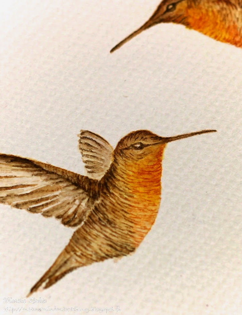
I am a big fan of Dawn Woleslagle from Wplus9. I've admired her colouring and watched her tutorials many times - actually she is the main source from where I have learned to colour. She is amazing and when this stamp set Flora and Fauna 2 was released and she made watercolour tutorial how to colour these hummingbirds, I was just blown away how beautiful creations she was able to achieve with just "adding colour to here and there". She says that colouring these birds isn't difficult. I was like... yeah right! But look, I am pretty impressed myself! Her tutorial is so amazing and you can watch it here. I did one thing differently, I used Derwent Inktense Pencils instead of Distress Markers to get those details and I think they worked very well with this technique too.

Here are what the card looks open up and a close-up from the humming bird.


I stamped the flowers and birds from Flora and Fauna 2 by Wplus9 with Memento Desert Sand ink and watercolored them with Spiced Marmalade and Gathered Twigs Distress Inks. I added details with Derwent Inktense Pencils. The front panel and sentiment is stamped with Versafine Vintage Sepia. After I cut the window I masked the frame and inked it with Gathered Twigs Distress Ink.

I will enter this into these challenges:

Here are the challenge's graphics:


Thank you for visiting and I hope you are having a great day! See you soon!

Marika